About a week ago, Max Sturtevant, known online as @wellcopymax, posted an Instagram Reel redesigning a marketing email for Fenty Beauty.

Watch the reel here: https://www.instagram.com/p/DXePgH4iKTu
In the video, Sturtevant reimagined the email with a cleaner, more minimal layout. According to his bio and company messaging, he has spent the last eight years working in e-commerce and is the founder of WellCopy, an email and SMS marketing agency focused on conversion-driven strategy.
The redesign was polished. It was clear, modern, and aligned with many current email marketing best practices.
But that raised an important question: Did Fenty Beauty’s email marketing design actually need fixing?
Clean Doesn’t Always Mean Better
Minimalist redesigns have become a popular genre of online design critique.
The result almost always looks better at first glance. And that’s generally the point. These redesigns are visually satisfying because they appeal to contemporary design preferences of simplicity, restraint, and polish.
But good design is not simply about looking cleaner. It’s about solving the right problem.
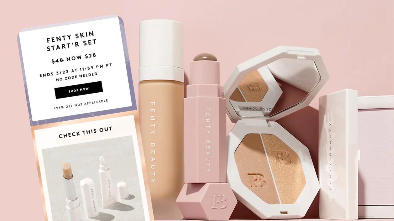
The Case for Fenty’s Existing Design
Rihanna built Fenty Beauty around disruption. When the brand launched, its emphasis on inclusivity, bold identity, and wide shade representation immediately differentiated it from legacy beauty brands. Its visual language reflects that same ethos.

Fenty Beauty’s email marketing design often includes:
- Bold, chunky typography
- High-contrast layouts
- Strong visual hierarchy
- Diverse model representation
- Product-forward compositions
All of these choices are completely intentional. They’re energetic choices which stay consistent with the brand’s voice.
To flatten that identity into something softer and more minimalist may improve readability, but it risks removing what makes the brand recognizable in the first place.
Brand consistency matters especially in crowded spaces like inboxes. When a customer opens an email, they should know exactly who it came from before reading a single line of copy. This is especially true when it comes to younger audiences who are more drawn in by visuals rather than typographic clarity.
Immediate recognition is a great tool for any brand, but it’s especially useful as one of Fenty Beauty’s most valuable assets.
Designing for Email Is Not Designing for Dribbble
This is where many public redesign critiques fall short.
Redesigns often prioritize visual appeal over business context. Email marketing design is not poster design and it’s not website design. It’s social content. Similar to what draws people into an Instagram post, an email marketing design needs to communicate the visual identity and voice of a brand.
Designing for email exists within a very specific set of constraints:
- It must load quickly
- It must function across devices
- It must guide attention immediately
- It must reinforce brand identity
Most importantly, it must encourage action. A “better-looking” email that lowers engagement or weakens brand recognition is not better design.
How to Actually Design for Email Marketing
1. Know the Brand
Minimalism will almost always look polished. That doesn’t mean it’ i’s always appropriate.
Strong email design starts with understanding the brand’s visual identity, tone, and audience expectations. Every brand has its own rhythm and it’s a designers job to recognize and design to that rhythm.
Some brands need restraint. Others need energy. As a designer, it’s important to when to do what and have designs driven by purpose and brand expectations.
A successful email should feel like an extension of the brand, not a generic template with a logo placed at the top.
2. Design for Recognition
When was the last time you sat down to actively read a marketing email? Probably never. What you most likely do is go through your inbox and only read something when the visuals catch your attention.
People don’t spend much time actually reading marketing emails. Most are skimmed, archived, or deleted within seconds. This means visual recognition and attention-grabbing visuals is critical.
Distinctive typography, color, layout systems, and imagery all help establish familiarity. If an email could belong to any company, it probably isn’t doing enough.
3. Focus on Community, Not Just Conversion
Yes, email marketing is designed to drive sales. But customers are increasingly sensitive to brands that feel transactional.
When every message is optimized solely for conversion, audiences notice and eventually, they’ll tune out.
The strongest email strategies build relationships rather than simply pushing products.
This can mean:
- Highlighting customer stories
- Sharing behind-the-scenes content
- Offering value beyond products
- Reinforcing brand values
People are more likely to buy from brands they feel connected to. Community builds loyalty and loyalty drives long-term revenue.
So, Did It Need to Be Fixed?

Not necessarily.
Fenty Beauty is a company that knows it’s values very well. They design their emails with that and their audience in mind. Sturtevant’s redesign was thoughtful and visually appealing, but “cleaner” is not the same as “better.”
The conversation around redesign culture often assumes that simplification equals improvement. In reality, effective design is rarely about removing as much as possible. It’s about understanding what needs to stay.
Sometimes boldness is the strategy and excess is part of the identity. And sometimes the most effective design decision is leaving things exactly as they are.
If you’re working on a brand identity and are looking for something other than minimalist design, check out our top upcoming design trends.